One of the main problem of the mosaicist is to find the right color
Even if some manufacturers of glass tesserae now propose amazing palettes, we do not have the ability to mix hues as a painter would. We seldom have more than 6 or 7 variations from one main color to an other one.
This is where we can be creative to – in a way, mix colors in a way closer to what a painter would do.
How to create a Grayscale
A lot of what we do with mosaic is tricking the eye and the brain of the observer into believing the colors vary continuously. We do not create a real color gradient, but the APPEARANCE of it.
Let’s say we want to create a rectangle, Black at the top, White at the bottom, with a gradient of grays in between
If we had 7 different grays in our tesserae, this is how it would look :

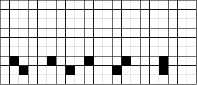
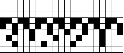
If we only have black and white tesserae, we can start by laying a row of white tesserae at the bottom :
Above it we build our 2nd row, with one black tessera in between blocks of 4 white tesserae. This row is 1/5 = 20 % black.

Above it an other line with one black tessera between blocks of 3 whites.
The 4th row: one black tessera between blocks of 2 whites.
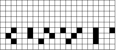
The 5th row alternates black and white tesserae. – here, we have the same amount of black and white.
The 6th row is built with 1 white tessera between blocks of 2 black.
The 7th row combines 1 white tessera between blocks of 3 black.
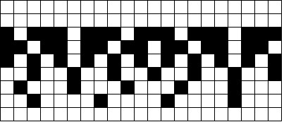
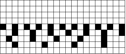
8th row combines 1 white tessera between blocks of 4 black.
Finally, the 9th row is composed of black only tesserae.
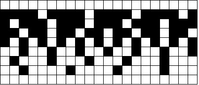
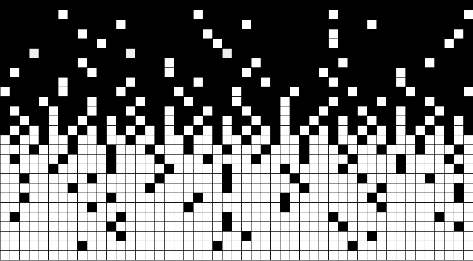
Seen from very close this only looks like a black and white combination. However, seen from far away, it begins to look much more like a grayscale color gradient.
The higher the percentage of black vs white is, the darker the area will look. This really is how Black and White TV sets used to work. The higher number of rows you have, the more accurate your colors are. A Black and White TV screen had 480 rows…
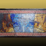
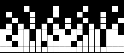
I built the image below with 27 rows instead of 9 for the examples above. If you put this image far away and squint your eyes to look at it, your brain will perceive a grayscale.
I will address in Parts 2 and 3 :
Part 2 : How to blend 2 colors other than Black and White.
Part 3 : How to create gradients with more than 2 different colors.